Using Custom Color Maps in Matplotlib and Seaborn
TL;DR: You can find the full code at the end of this post.
Most of the time, the colormaps in matplotlib and seaborn are sufficient for my needs. However, sometimes I want to use a custom colormap. For example, when I want to use the colors of my institute in my plots, which I know they prefer when it comes to publications and internal presentations. In this post, I will show you how to use custom colormaps in matplotlib and seaborn using the colors from the corporate design of my institute as an example.
I am sure, there is more than one way to create custom colormaps, but this is how I do it.
1. Import the necessary packages
import matplotlib as mpl
from matplotlib.colors import ListedColormap
import seaborn as sns
import numpy as np
from cycler import cycler
Don’t bother about how to install the cycler package. It should be installed by default with matplotlib.
2. Define the colors
I got the colors from the corporate design of my institute. I am sure, you can find the colors of your institute or company somewhere on the internet/intranet. If not, you can use the color picker of your favorite image editing software to extract the colors from the logo of your institute or company.
hereon_color_array = np.array([
    [230, 0, 70],
    [0, 145, 160],
    [0, 170, 230],
    [250, 180, 35],
    [0, 70, 125],
    [175, 25, 60],
    [170, 200, 70],
    [250, 115, 80],
    [140, 90, 180],
])
hereon_color_array /= 255
3. Set the colormap as default
For matplotlib, we first have to convert it to a ListedColormap and then can set it as a default:
hereon_cmap = ListedColormap(hereon_color_array)
mpl.rcParams['image.cmap'] = hereon_cmap
mpl.rcParams['axes.prop_cycle'] = cycler(color=hereon_color_array)
For seaborn it is even easier:
sns.set()  # sets the default seaborn style
sns.set_palette(hereon_color_array)
4. Example usage
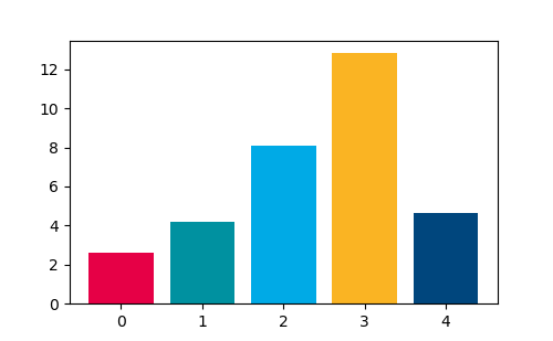
Matplotlib:
import matplotlib.pyplot as plt

data = np.random.uniform(1, 20, 5)

fig, ax = plt.subplots(figsize=(5, 5))
for i, bar in enumerate(data):
    ax.bar(i, bar)
plt.show()

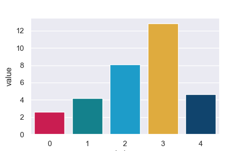
And in Seaborn:
import pandas as pd
sns.set()
sns.set_palette(hereon_color_array)

data_dict = {key: value for (key, value) in enumerate(data)}
data = pd.DataFrame.from_dict(data_dict, orient="index", columns=["value"]).reset_index()
sns.barplot(data=data, x="index", y="value")
plt.show()

Complete code:
import matplotlib as mpl
from matplotlib.colors import ListedColormap
import seaborn as sns
import numpy as np
from cycler import cycler

hereon_color_array = np.array([
    [230, 0, 70],
    [0, 145, 160],
    [0, 170, 230],
    [250, 180, 35],
    [0, 70, 125],
    [175, 25, 60],
    [170, 200, 70],
    [250, 115, 80],
    [140, 90, 180],

])
hereon_color_array = hereon_color_array / 255
hereon_cmap = ListedColormap(hereon_color_array)
mpl.rc('image', cmap='gray')
mpl.rcParams['axes.prop_cycle'] = cycler(color=hereon_color_array)

# Example Matplotlib:
import matplotlib.pyplot as plt

data = np.random.uniform(1, 20, 5)

fig, ax = plt.subplots(figsize=(5, 5/1.618))
for i, bar in enumerate(data):
    ax.bar(i, bar)
plt.savefig("barplot_mpl.png")
plt.show()


# Example Seaborn:
import pandas as pd
sns.set()
sns.set_palette(hereon_color_array)

fig, ax = plt.subplots(figsize=(5, 5/1.618))
data_dict = {key: value for (key, value) in enumerate(data)}
data = pd.DataFrame.from_dict(data_dict, orient="index", columns=["value"]).reset_index()
sns.barplot(data=data, x="index", y="value", ax=ax)
plt.savefig("barplot_sns.png")
plt.show()